Getting more website traffic isn't always the fastest way to generate more leads.
Sometimes the opportunity is already on the website.
People are visiting. They're just not taking the next step.
If that's happening, buying more traffic can amount to pouring more water into a leaky bucket.
The better question is:
Where are potential customers getting stuck between arriving on your website and contacting your business?
For a service business, turning more website visitors into leads usually isn't about finding one magical button color, installing another popup, or redesigning the entire site.
It's about removing friction from the journey.
A potential customer needs to understand what you do, determine whether you're relevant to them, trust you enough to continue, find an appropriate next step, and complete that step without unnecessary difficulty.
Then something needs to happen after they do.
That's the conversion process we're going to improve.
First: Make Sure You Actually Have a Website Conversion Problem
Before changing your website, figure out what you're trying to fix.
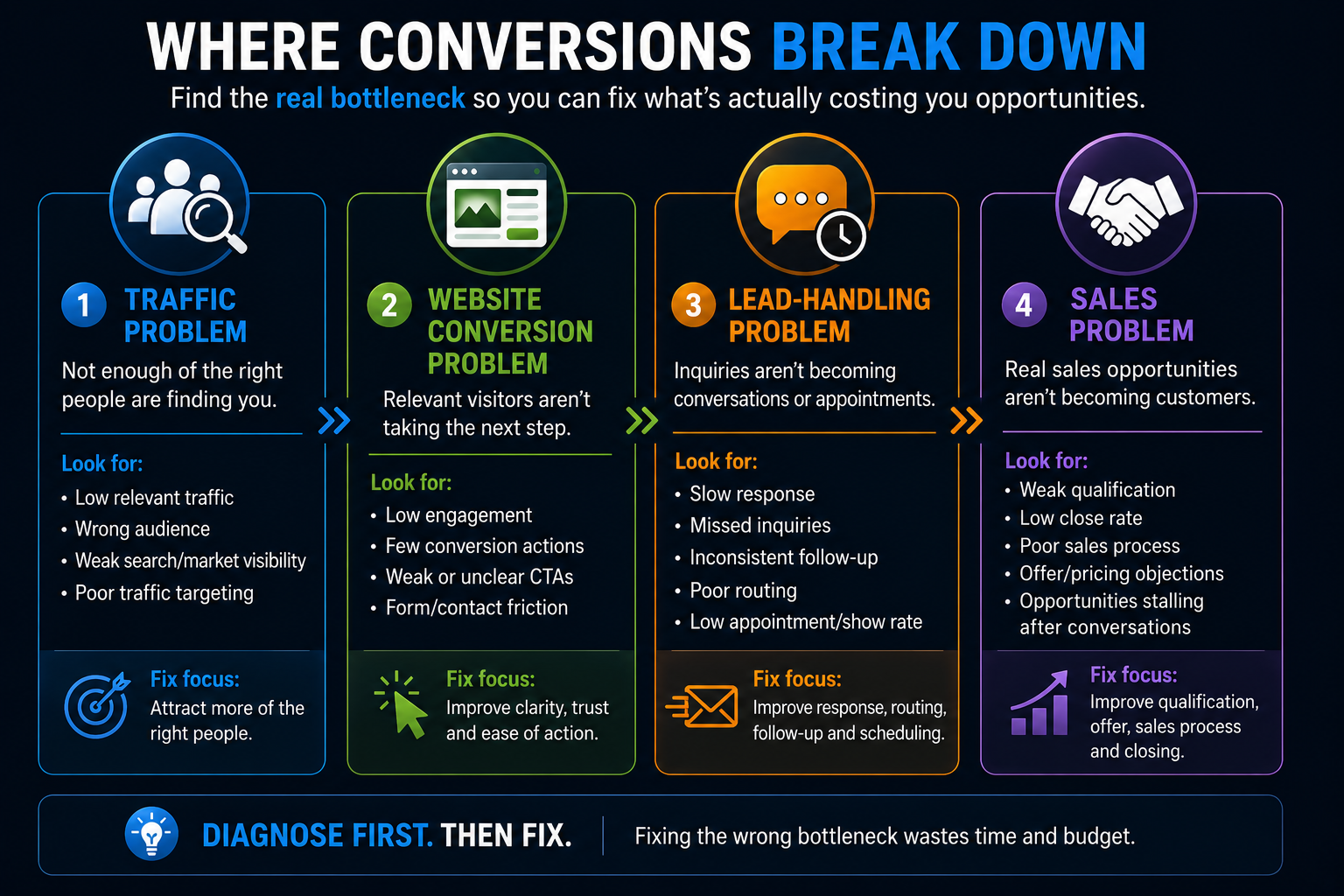
A business generating too few opportunities could have several completely different problems.
Traffic Problem
Not enough relevant potential customers are reaching the website.
Improving conversion can help, but there is a limit to what you can squeeze out of almost no qualified traffic.
Website Conversion Problem
Relevant people are reaching the website, but too few are calling, submitting forms, starting conversations, or scheduling.
Now the website deserves serious attention.
Lead-Handling Problem
People are contacting the business, but responses are slow, inconsistent, poorly routed, or nonexistent.
At that point, redesigning another CTA probably isn't your highest-priority fix.
Sales Problem
The business is generating inquiries and having conversations, but those opportunities aren't becoming customers.
That's a different problem again.
This distinction matters because businesses frequently try to solve the wrong bottleneck.
They buy more ads when conversion is weak.
They redesign the website when leads aren't being followed up with.
They blame lead quality when nobody responds for three hours.
We've discussed this broader problem in Why Getting More Leads Isn't Always the Answer.
Before trying to increase website leads, identify whether traffic, conversion, lead handling, or sales is actually limiting growth.
If website conversion really is the bottleneck, here are 12 places I'd look.
1. Match the Page to Why the Visitor Came
Not every visitor arrives with the same intent.
Someone searching for:
kitchen remodeling contractor near me
has a different immediate need from someone searching:
how much does a kitchen remodel cost?
And someone clicking an ad for commercial tenant build-outs shouldn't land on a generic page that makes them dig through residential services to figure out whether they're in the right place.
The closer the page matches the reason someone arrived, the easier it becomes for that person to continue.
That can mean creating focused pages around:
- important services
- distinct customer types
- locations when genuinely relevant
- high-intent advertising campaigns
- specific problems or needs
This isn't an argument for creating hundreds of thin SEO pages.
It's an argument for relevance.
When someone lands on a page, they shouldn't have to investigate your company to determine whether you can help them.
2. Make the Value Proposition Obvious Quickly
A visitor shouldn't need to read five paragraphs before understanding what your business does.
Early in the page, answer the obvious questions:
What do you do?
Who is it for?
Where do you provide it, if location matters?
Why should someone consider you?
That doesn't mean your hero section needs to explain the entire company.
It means clarity beats cleverness.
Compare:
Building Tomorrow's Possibilities Today
with:
Commercial Tenant Build-Outs for Multi-Location Brands
The first might sound polished.
The second tells a specific visitor whether they've found something relevant.
Your actual wording will depend on the business, but the principle holds:
Don't make potential customers decode the offer.
3. Give Every Important Page a Clear Next Step
A surprising number of websites explain the service reasonably well and then leave the visitor wondering what to do.
Your primary next step might be:
- Request a quote
- Schedule a consultation
- Call now
- Check availability
- Start a conversation
- Request an estimate
- Book an appointment
The right CTA depends on the business and the visitor's intent.
A $79 service call and a $500,000 commercial construction project probably shouldn't have identical conversion paths.
The important thing is that the next step is clear.
That usually means having a primary CTA in logical places throughout the page rather than one lonely button at the very top.
But there's another extreme to avoid.
More CTAs do not automatically create more conversions.
If every section screams:
CALL NOW!
GET A QUOTE!
BOOK TODAY!
CHAT WITH US!
LIMITED TIME!
you haven't created clarity.
You've created a website with anxiety.
Give people obvious next steps without turning the page into Times Square.
4. Reduce Unnecessary Form Friction
Every field creates a small amount of work.
Sometimes that work is justified.
Sometimes it isn't.
If all you need to start a conversation is:
- name
- phone or email
- service needed
asking for twelve additional pieces of information may create unnecessary friction.
On the other hand, a complex commercial project may legitimately require more information before the business can determine whether the opportunity is a fit.
The question isn't:
How short should every form be?
It's:
What information do we genuinely need at this stage of the relationship?
Ask for that.
You can gather more information later.
Form implementation matters too. Clear labels, appropriate input types, autofill support, useful validation, and mobile-friendly fields can make forms easier to complete. Google's web.dev guidance specifically recommends designing forms to work well with browser autofill and appropriate field attributes.
The goal is simple:
Don't make contacting your company feel like applying for a mortgage.
5. Give Visitors More Than One Sensible Way to Convert
People don't all want to communicate the same way.
One visitor may happily complete a form.
Another wants an answer before giving you their information.
Another already knows what they want and would rather schedule immediately.
Another wants to call.
That's why the question isn't necessarily:
Should my website use forms, chat, or online scheduling?
Often, the better question is:
Which combination makes sense for this customer journey?
We've broken that decision down separately in Website Forms vs. Chat vs. Online Scheduling.
The key is choice without chaos.
Offering three reasonable contact options can help.
Throwing seven competing widgets at someone probably won't.
6. Build Trust Before Asking for Action
A visitor isn't evaluating only the service.
They're evaluating whether they believe you can deliver it.
Trust can come from many places:
- genuine customer reviews
- real project photography
- before-and-after examples
- relevant credentials
- licenses where applicable
- warranties or guarantees you actually provide
- recognizable partners or manufacturers
- clear company information
- detailed service explanations
- realistic expectations
- professional design and presentation
For local service businesses, real evidence usually beats generic claims.
“Quality you can trust” says almost nothing.
Showing a completed project, explaining the process, displaying legitimate reviews, and making it obvious who the company serves gives someone something tangible to evaluate.
And please don't plaster meaningless security badges and fake countdown timers everywhere.
Trust isn't something you decorate onto a page.
It's something the page earns.
7. Make Mobile Conversion Easy
For many service businesses, a potential customer will encounter the website on a phone.
That changes the experience.
Buttons need to be usable.
Text needs to be readable.
Forms need to work without constant zooming and correcting.
Phone numbers should be easy to call when calling makes sense.
Chat shouldn't cover half the screen.
Sticky elements shouldn't trap the visitor inside six layers of buttons.
And the page shouldn't jump around while someone is trying to tap something.
A desktop design squeezed onto a smaller screen is not a mobile strategy.
Actually use the site on a phone.
Try to:
- navigate the menu
- understand the service
- submit the form
- start a chat
- schedule
- call the business
- close any popup
- return to the previous section
You'll often find problems that weren't obvious from a desktop preview.
8. Fix Performance Problems That Interfere With the Journey
Speed matters.
But I don't like the way website performance is sometimes discussed.
You'll see claims implying that shaving a specific number of milliseconds from a page automatically creates a predictable percentage increase in sales.
Real businesses aren't that tidy.
Performance matters because waiting, instability, and unresponsive interfaces create friction.
Google's current Core Web Vitals framework focuses on three aspects of user experience:
- Largest Contentful Paint (LCP) — loading performance
- Interaction to Next Paint (INP) — responsiveness
- Cumulative Layout Shift (CLS) — visual stability
Google currently recommends, at the 75th percentile of page loads:
- LCP within 2.5 seconds
- INP of 200 milliseconds or less
- CLS of 0.1 or less
Those are useful technical targets.
But don't turn them into the entire conversion strategy.
A lightning-fast website with a confusing offer can still convert terribly.
A clear website shouldn't be unnecessarily slow either.
You need both.
9. Use Chat to Remove Uncertainty
Website chat can be useful when it helps someone move forward.
For example, a visitor might want to know:
- Do you service my area?
- Do you handle this type of project?
- How does the process work?
- Can I schedule an estimate?
- Do you offer a particular service?
- What happens next?
A well-designed chat experience can answer questions, collect useful information, and direct someone toward the appropriate next step.
AI can make this more capable because conversations don't have to rely entirely on rigid button trees or office-hour availability.
But AI chat shouldn't exist just because someone wanted an “AI feature” on the website.
Bad chat is still bad chat.
An aggressive bot that interrupts the visitor, gives unreliable answers, or traps someone in an endless conversation can create more friction than it removes.
The goal isn't:
Use AI.
The goal is:
Help the visitor progress.
That's part of the broader distinction we make when talking about what an AI-powered website actually is.
10. Offer Online Scheduling When the Visitor Is Ready
Sometimes a visitor doesn't need another conversation before scheduling.
They're ready.
Making that person:
- submit a form
- wait for someone to respond
- exchange messages
- receive a scheduling link
- finally choose a time
can create steps that didn't need to exist.
For the right service, allowing qualified visitors to schedule directly can shorten the path.
But online scheduling isn't automatically appropriate everywhere.
A contractor may need to understand project type and location first.
A complex B2B service may require qualification.
An emergency service may need a phone call.
A consultation-based business may be perfectly suited to direct scheduling.
Match the conversion mechanism to the buying process.
Don't force the buying process to fit whatever widget happens to be installed.
11. Don't Let the Conversion Die After Someone Clicks Submit
This is where website conversion discussions often stop too early.
Someone fills out the form.
Success!
Technically, yes.
Operationally, maybe not.
What happens next?
Does the inquiry:
- enter a CRM?
- notify the right person?
- receive immediate acknowledgment?
- get routed correctly?
- trigger appropriate follow-up?
- offer scheduling?
- disappear into someone's inbox?
A website can generate a perfectly legitimate lead and the business can still waste it.
That's why we think of the website as part of a larger conversion system rather than an isolated brochure.
We've covered what happens after a website lead and what a lead conversion system actually does in more detail.
This is also where the Booked Calendar System™ fits into the larger picture.
The website creates the opportunity for contact.
The system after it helps turn that contact into an actual conversation, appointment, or sales opportunity through response, routing, follow-up, scheduling, and related workflows.
Conversion doesn't end when the form says “Thank you.”
12. Measure the Journey Instead of Guessing
You can't intelligently improve conversion if you don't know what's happening.
At minimum, understand:
- how many relevant visitors reach important pages
- where those visitors come from
- which pages they enter through
- what conversion actions matter
- how often those actions occur
- whether those actions become qualified opportunities
Google Analytics 4 allows businesses to mark important actions as key events. Depending on the website, that could include actions such as successful lead-form submissions.
That gives you a much better starting point than:
The website feels slow this month.
or:
I think the new button is working.
Don't Obsess Over Someone Else's Conversion Rate
Business owners naturally want to know:
What's a good website conversion rate?
The problem is that the answer depends heavily on context.
A conversion rate can vary based on:
- traffic source
- search intent
- service
- price
- location
- landing page
- brand recognition
- offer
- device
- what counts as a conversion
A visitor searching your company name is not equivalent to someone who clicked a broad informational article.
A request for a free estimate isn't equivalent to a qualified consultation for a six-figure project.
So instead of blindly chasing somebody else's benchmark:
Establish your baseline.
Then improve the rate at which relevant visitors become qualified opportunities.
That's the number that matters.
A Simple Website Conversion Diagnostic
When a website isn't generating enough business, walk through the journey in order.
Step 1: Are the Right People Arriving?
If not, investigate traffic quality, SEO, advertising, targeting, positioning, and demand.
Step 2: Do They Immediately Understand the Offer?
If not, improve relevance, messaging, hierarchy, and clarity.
Step 3: Do They Have Enough Reason to Trust the Business?
If not, strengthen evidence, proof, expectations, and presentation.
Step 4: Is the Next Step Obvious and Easy?
If not, examine CTAs, forms, chat, scheduling, mobile usability, and unnecessary friction.
Step 5: What Happens After They Convert?
If response, routing, and follow-up break down here, the bottleneck has moved beyond the webpage.
Step 6: Do Those Leads Become Real Opportunities?
If leads are being handled properly but rarely become viable sales conversations, examine qualification, offer, pricing, and sales process.
That gives us a more useful model than simply saying:
We need more website leads.
Think about the journey as:
Traffic → Clarity → Trust → Action → Response → Opportunity
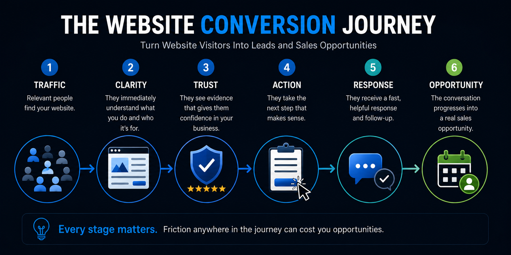
A weakness anywhere in that chain can reduce revenue.
And not every weakness should be fixed with more traffic.
What Usually Doesn't Fix a Conversion Problem
There are a few things I'd be careful about.
Redesigning Everything Because the Site “Feels Old”
Sometimes a redesign is absolutely justified.
Sometimes the existing website has a specific conversion problem that could be fixed without burning the entire thing down.
Diagnose before demolishing.
Adding More Popups
A popup can have a purpose.
Five competing interruptions generally don't make the website five times more persuasive.
Copying a Competitor
You don't know whether their website converts.
You know what it looks like.
Those are different things.
Adding AI Everywhere
AI can improve chat, personalization, follow-up, qualification, content workflows, and other parts of the customer journey.
It can also become pointless decoration.
Use it where it removes friction or creates meaningful capability.
Obsessing Over Button Colors
Could button contrast matter?
Of course.
Is changing blue to orange likely to rescue a fundamentally confusing customer journey?
Probably not.
Fix the big problems first.
The Best Conversion Improvements Usually Remove Friction
There's a theme running through all 12 strategies.
The goal isn't to pressure someone into becoming a lead.
It's to make it easier for the right person to move forward.
That means removing unnecessary questions.
Removing confusion.
Removing uncertainty.
Removing waiting.
Removing technical problems.
Removing needless steps.
And sometimes removing half the junk somebody added to the website because a marketing blog told them it would “boost conversions.”
A good conversion experience feels surprisingly uneventful.
The visitor understands.
They trust what they're seeing.
They know what to do.
They do it.
The business responds.
That's the machine.
Traffic Is More Valuable When the Website Can Do Something With It
There is nothing wrong with generating more traffic.
SEO, Google Ads, social media, referrals, directories, and other channels can all create valuable opportunities.
But traffic becomes more valuable when the website is prepared to convert it.
That's why an AI-powered website shouldn't be judged only by how modern it looks.
It should help the business:
- communicate clearly
- build trust
- capture intent
- start conversations
- route opportunities
- support scheduling
- connect with follow-up systems
If your website is already getting relevant traffic but too little of it becomes business, more traffic may not be the first thing you need.
You may need to fix what happens to the traffic you already have.
Want to Know Where Your Website Is Losing Opportunities?
If you're getting website traffic but not enough conversations, appointments, or qualified inquiries, the answer isn't automatically another ad campaign.
There may be friction somewhere between arrival and opportunity.
Boost Local Biz builds AI-powered websites around that entire journey—not simply around making the site look newer.
That can include the website experience itself along with lead capture, AI-assisted conversations, CRM integration, automated response, follow-up, routing, and scheduling where they make sense.
The goal isn't a prettier website. It's a website that does a better job helping the business turn attention into opportunity.
Want a quick way to look at your own site the way a potential customer would? Try our 5-Minute Local Business Website Test.
Explore AI-Powered Websites.