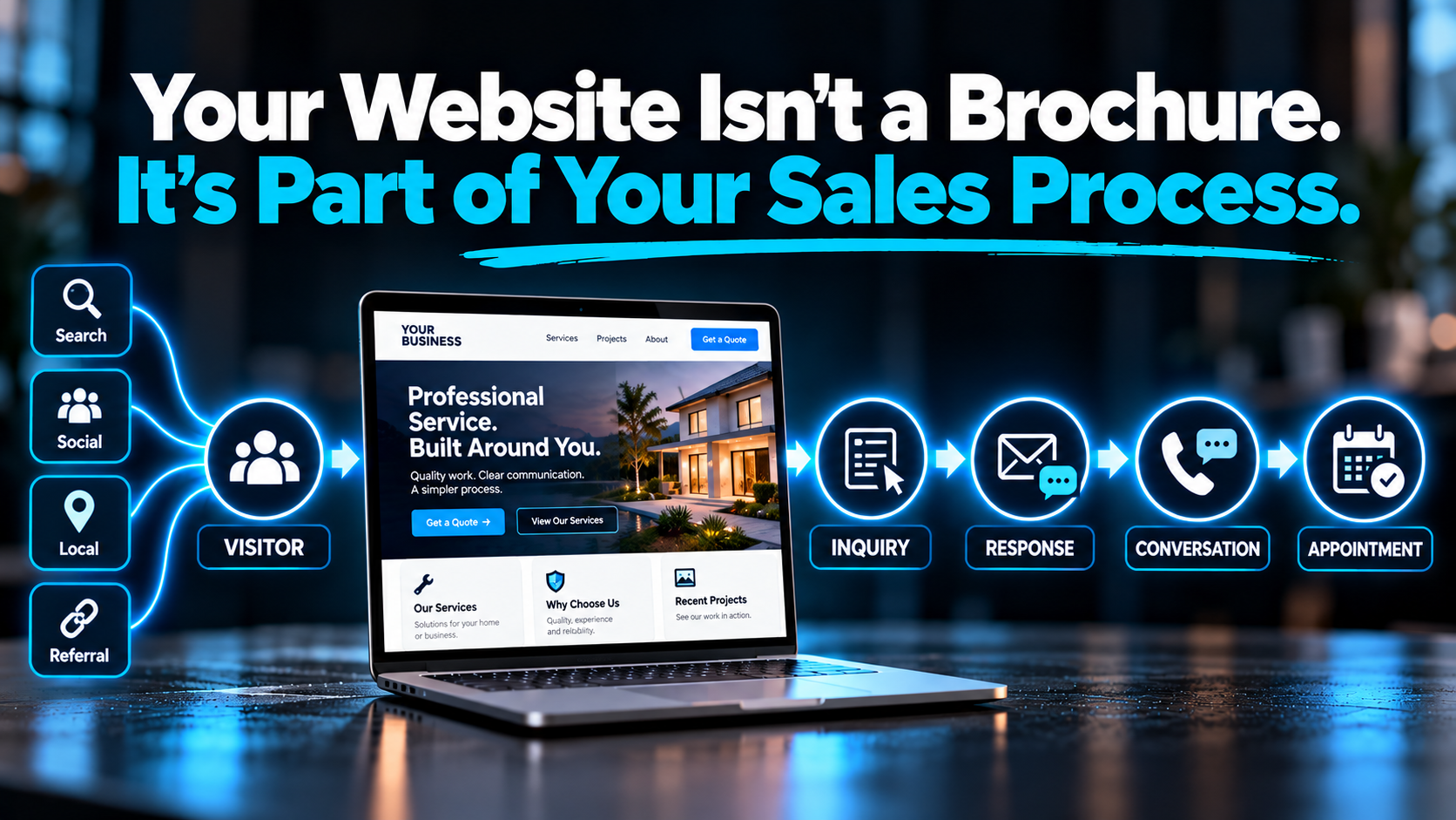
A lot of business websites are still built like digital brochures.
Here’s who we are.
Here’s what we do.
Here are some pictures.
Here’s our phone number.
And technically, there’s nothing wrong with any of that. Your website should explain your business.
The problem is when that’s where the thinking stops.
Because someone visiting your website usually isn’t there to admire the website. They’re trying to make a decision.
Can you solve my problem?
Do you serve my area?
Do I trust you?
What does this cost?
What happens next?
How do I get started?
A good website helps move that decision forward.
That’s why I don’t think of a business website as an online brochure. I also don’t love the cliché that your website is your “24/7 salesperson.”
It’s neither.
Your website is part of your sales process.
And once you start looking at it that way, you build a very different website.
What Makes a Website Part of the Sales Process?
A website becomes part of the sales process when it helps a prospective customer understand what you offer, determine whether you’re relevant to their needs, trust your business, take the appropriate next step, and then passes that inquiry into a reliable response, tracking, and follow-up process.
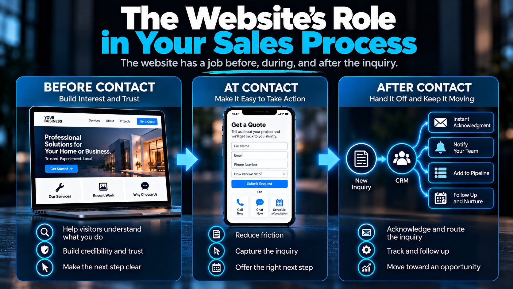
In other words, the website has a job before someone contacts you, a job when they decide to contact you, and a job in the handoff immediately afterward.
Think about the larger journey:
Traffic → Website → Interest → Inquiry → Response → Conversation → Appointment → Customer
Your website doesn’t control every step.
Nor should it.
Eventually, a salesperson, estimator, technician, office manager, owner, or another human being may need to take over.
But the website can make everything before that conversation dramatically easier — or dramatically harder.
A Brochure Website and a Sales-Process Website Ask Different Questions
A brochure-style website usually starts with a question like:
“What information should we put on our website?”
That leads to the usual pages:
Home.
About.
Services.
Gallery.
Contact.
Again, none of those pages are inherently wrong. In fact, most businesses probably need several of them.
But a website designed around the sales process starts with a different question:
“What does a prospective customer need to understand, trust, and do next — and what should happen when they do it?”
That changes the conversation.
| Brochure Mindset | Sales-Process Mindset |
|---|---|
| Presents company information | Guides a prospective customer |
| Organizes content around the business | Organizes content around customer questions and intent |
| Prioritizes appearance | Uses design to improve clarity, trust, and action |
| Lists services | Connects services to customer needs |
| Sends everyone to “Contact Us” | Provides the appropriate next step |
| Treats a form submission as the finish line | Treats an inquiry as a handoff |
| Often operates separately from sales systems | Connects lead capture to response, tracking, and follow-up |
That last difference is where this gets especially important.
But first, let’s look at what the website should be doing before anyone ever contacts you.
Before Contact: Your Website Is Already Part of the Conversation
Imagine someone lands on your website after searching for a service you provide.
You haven’t spoken to them.
They haven’t filled out a form.
They haven’t called.
But a conversation has effectively started.
They’re asking questions in their head, and your website is answering them — whether you designed it to or not.
What exactly does this company do?
Do they handle the kind of project I have?
Do they work in my area?
Do they look legitimate?
Have they done this before?
Why should I choose them instead of the other three companies I just opened in separate tabs?
That’s early-stage selling.
Not the pushy kind.
The useful kind.
Your website should make it easy for the right visitor to understand what you do, recognize that they’re in the right place, find answers to important questions, see evidence that supports your credibility, and understand the next logical step.
This is one reason the structure of a service-business website matters so much.
You aren’t simply deciding which pages look good in the navigation.
You’re deciding what information a prospective customer needs in order to keep moving.
And if people are already reaching the site but not taking that next step, that becomes a different diagnostic problem. We covered that specifically in 7 Reasons Your Website Gets Traffic but Not Leads.
At Contact: Don't Make Interested People Work for It
Eventually, some visitors reach a point where they’re ready to do something.
This is where a surprising number of websites create unnecessary friction.
The phone number is buried.
The only button says “Contact Us.”
The form asks for information the business doesn’t actually need yet.
The visitor has no idea whether they’re requesting an estimate, asking a question, scheduling an appointment, or sending a message into the void.
If someone has already decided they’re interested, your website shouldn’t make them solve a puzzle.
Depending on the business, the appropriate next step might be:
- calling
- requesting an estimate
- completing a short form
- starting a chat
- sending a text
- scheduling a consultation
- booking an appointment
Not every business needs every option.
More buttons do not automatically create more conversions.
The goal is to give the right visitor the right next step with as little unnecessary friction as possible.
That’s an important distinction.
A roofing company offering a major replacement project may need a different conversion path than a business where customers can legitimately book a standard appointment immediately.
The website should support how the business actually sells.
If you want to go deeper into this part of the journey, I’ve also broken down how to turn website visitors into leads.
But getting the inquiry is only half the story.
After Contact: The Submit Button Is Not the Finish Line
This is where I think a lot of website strategy stops too early.
Someone fills out the form.
Google Analytics records a conversion.
Everybody celebrates.
But what did the business actually get?
A customer?
No.
It got an inquiry.
And an inquiry is only valuable if something useful happens next.
The same applies to a phone call, chat conversation, or quote request.
Those are opportunities.
They still need to be handled.
That means the website needs to hand the opportunity into the business cleanly.
Depending on the company, that handoff might include:
- immediately acknowledging the inquiry
- notifying the right person
- creating or updating a CRM contact
- placing the opportunity into a pipeline
- assigning responsibility
- starting the appropriate follow-up
- qualifying the lead
- providing a scheduling path
- sending reminders
- nurturing someone who isn’t ready yet
This is the point where website strategy starts overlapping with lead conversion.
And it’s why we built an entire guide around what should happen after someone fills out your website form.
A beautiful form that sends an email to an inbox nobody checks for three hours is not a great conversion system.
It’s just a beautiful form.
Try the Handoff Test
Here’s a simple test I like because you can answer it without looking at a single website metric.
Imagine a qualified prospect submits the main form on your website right now.
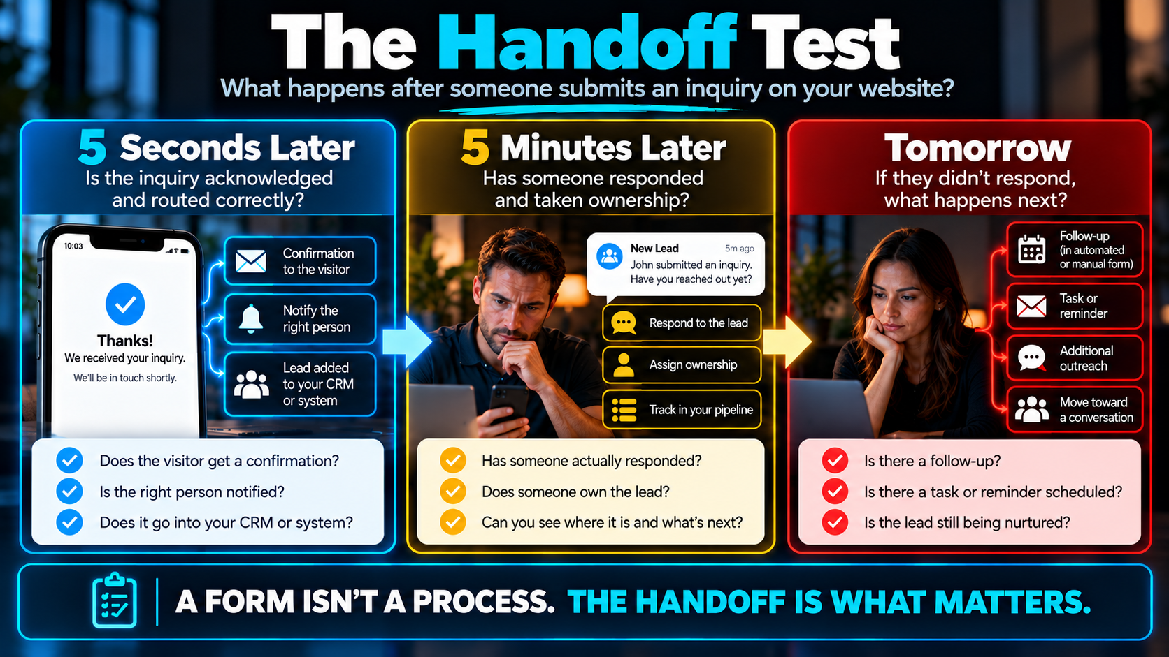
Ask yourself:
What happens five seconds later?
Does the prospect receive any acknowledgment? Does anyone inside the business know the inquiry arrived?
What happens five minutes later?
Has somebody responded? Does anyone own the lead? Can you see where it is in your process?
What happens tomorrow if the prospect never responds?
Does someone follow up again? Is there a task? An automated message? A reminder? A pipeline stage? Anything? Or is everyone assuming somebody else handled it?
That is the difference between having a form on your website and having a lead-conversion process connected to your website.
And if that handoff is weak, sending more leads into it doesn’t necessarily solve the problem.
It can simply create more opportunities to lose.
That’s exactly why I recommend businesses examine the conversion infrastructure before automatically increasing marketing spend. I went deeper into that in Before You Spend Another Dollar on Leads, Fix This.
Good Design Still Matters
Whenever you make the argument that a website should do more than look good, there’s a temptation to swing too far in the other direction.
So let me be clear:
Ugly is not a conversion strategy.
Good design matters.
Visual design can make a company feel more professional. It can improve readability, create hierarchy, reduce confusion, strengthen branding, and make the entire experience easier to use.
A website can absolutely be beautiful and effective.
The problem is judging a website primarily by whether everyone likes the design.
I care much more about questions like:
Can people immediately understand what the business does?
Can they find the information they need?
Does the website create confidence?
Does it work well on a phone?
Is the next step obvious?
And when someone takes that step, does anything useful happen?
Design should support those outcomes.
Not compete with them.
This Is Where an AI-Powered Website Becomes More Interesting
The term “AI-powered website” gets thrown around pretty loosely.
Sometimes it just means somebody used AI to help write the copy or build the site.
That’s not what makes the concept interesting to me.
The more useful question is:
What can the website actually help the business do?
Depending on the company, that might include answering common questions through conversational AI, capturing an inquiry, collecting basic qualification information, helping someone schedule, immediately acknowledging a new lead, routing information into a CRM, or triggering the appropriate follow-up process.
That doesn’t mean every website needs an AI chatbot, seven automations, and a robot lurking behind every button.
Technology should earn its place.
If a normal form is the simplest and best experience, use the form.
If someone needs a human conversation, get them to a human.
If automation can eliminate a two-hour delay in acknowledging a new inquiry, that may be useful.
The goal isn’t to cram AI into the website.
The goal is to build a better customer journey and a better business process.
That’s the distinction I make when talking about what an AI-powered website actually is.
The Website Should Fit the Way the Business Actually Sells
There isn’t one universal conversion path.
A plumber handling urgent calls operates differently from a custom pool builder selling a six-figure project.
A law firm has a different qualification process than a landscaping company.
A dentist may be able to offer direct scheduling for certain appointments while a remodeling contractor may need a consultation first.
That’s why blindly copying another company’s website is rarely the answer.
Your website should reflect the decisions your customers need to make and the process your business actually uses to turn interest into revenue.
Sometimes that means the website needs to do more.
Sometimes it means simplifying it.
But either way, it should connect logically to what happens next.
Stop Measuring the Website at the Submit Button
There’s a useful shift that happens when you stop treating the website as an isolated marketing asset.
Instead of asking only:
“How many leads did the website generate?”
you can start asking:
“How effectively does the website help create real opportunities for the business?”
Those aren't exactly the same question.
A website could generate 100 inquiries and still create a mess if nobody responds quickly, half the leads disappear into an inbox, and there’s no consistent follow-up.
Another website could generate fewer inquiries but make it easier for the business to identify, respond to, and advance legitimate opportunities.
Lead volume still matters.
Conversion rate still matters.
Traffic still matters.
But they make more sense when viewed as parts of a larger system.
Your Website Doesn't Need to Do Everything
It just needs to do its part.
Help the right people understand what you do.
Give them reasons to trust you.
Make the next step clear.
Remove unnecessary friction when they decide to take it.
Then make sure the opportunity gets handed to a process capable of doing something with it.
That’s a much more useful standard than asking whether your website looks modern.
Because the goal isn’t simply to have a better website.
It’s to create a clearer path from:
Visitor → Inquiry → Opportunity
And make sure the business is ready when someone walks down it.
Let's Find Out Where the Friction Is.
We'll look at how your website communicates, builds trust, creates action, and hands new inquiries into the rest of your sales process.